About the project
A music and podcast brand concept — one wordmark carried from an app promo screen across headphones, a speaker, a turntable, and a festival sponsorship.
Concept study
2024
Identity, Art direction, Packaging
Consumer audio / entertainment
Design question
How does one wordmark stay recognisable from a lock screen to a listening room?
Pod is a self-directed 2024 brand concept for a music and podcast app — a logo built to travel from a phone screen onto headphones, speakers, and a festival stage, not a commissioned client engagement.
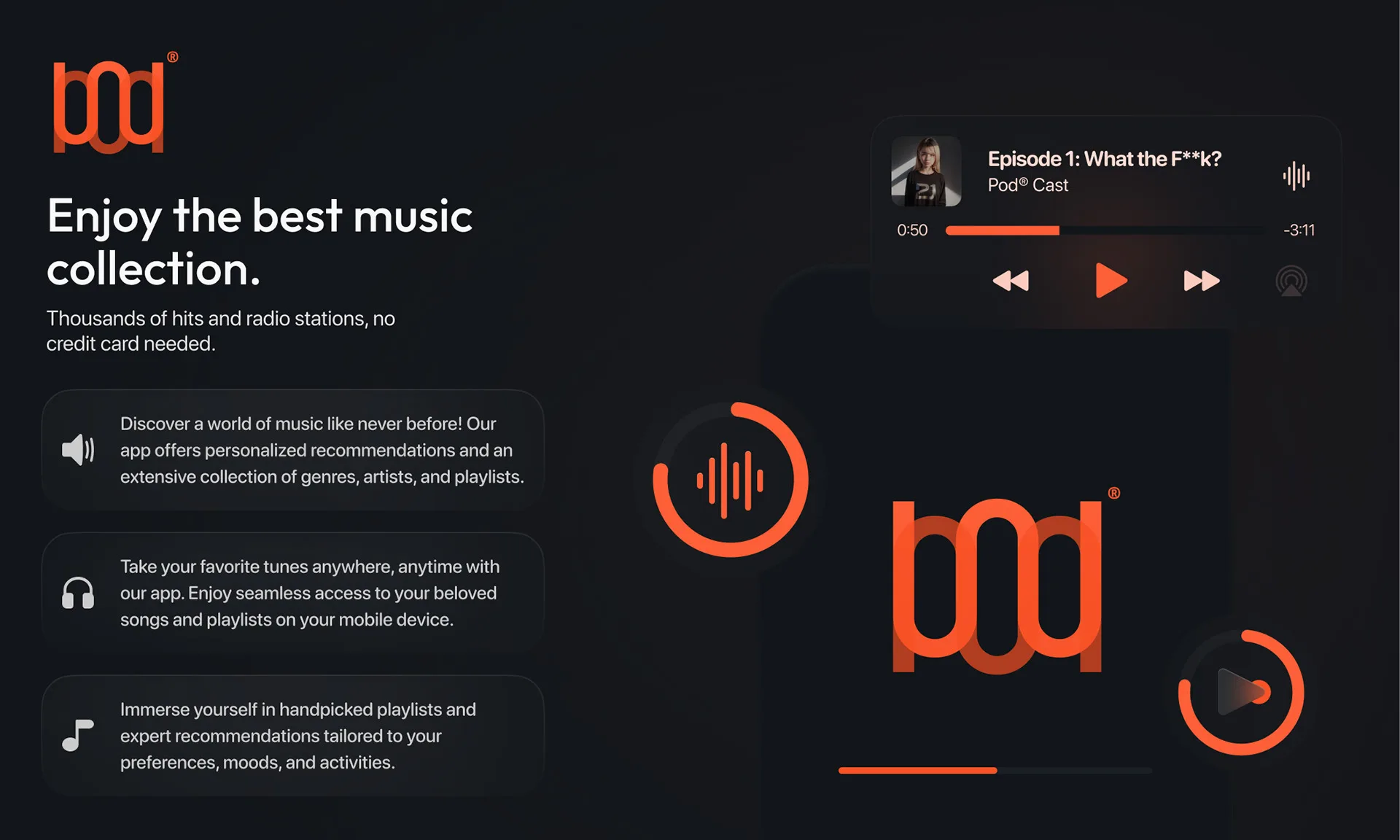
The app promo leads with the mark, not a screenshot.
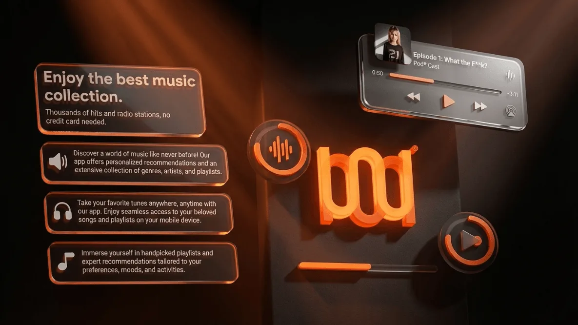
The bod wordmark, a stacked feature list, and a now-playing card carry the pitch — thousands of stations, personalised recommendations, no credit card required.
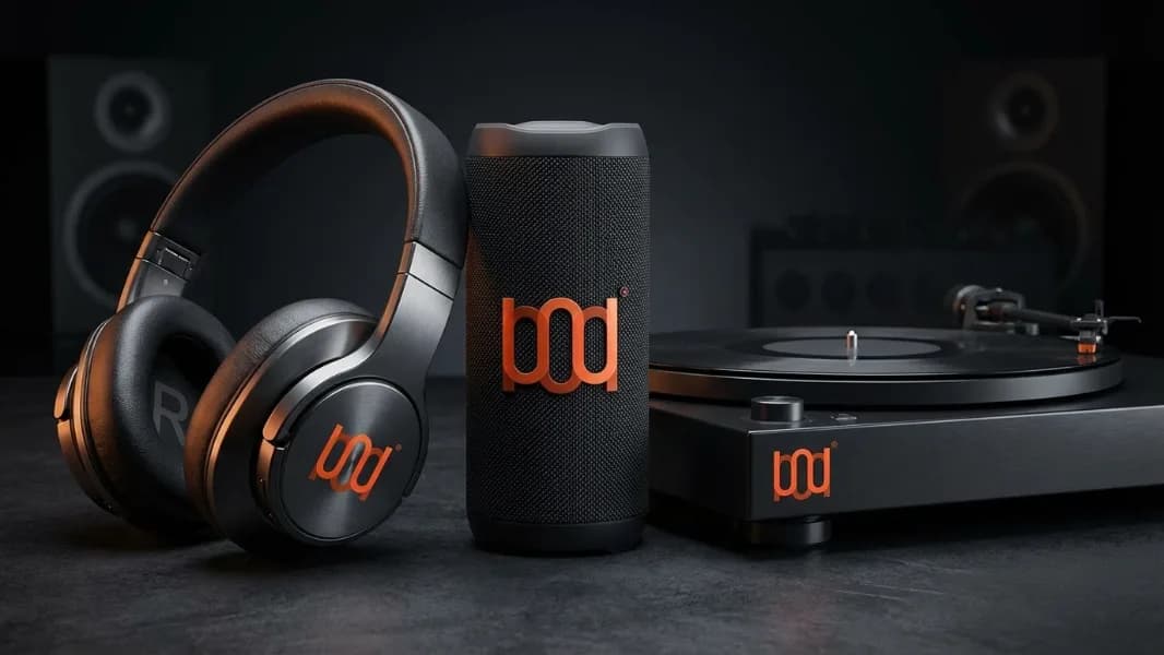
The mark holds up stamped into hardware.
Headphones, a portable speaker, and a turntable each carry the same lockup in a single burnt-orange finish, tested across leather, fabric, and glass.
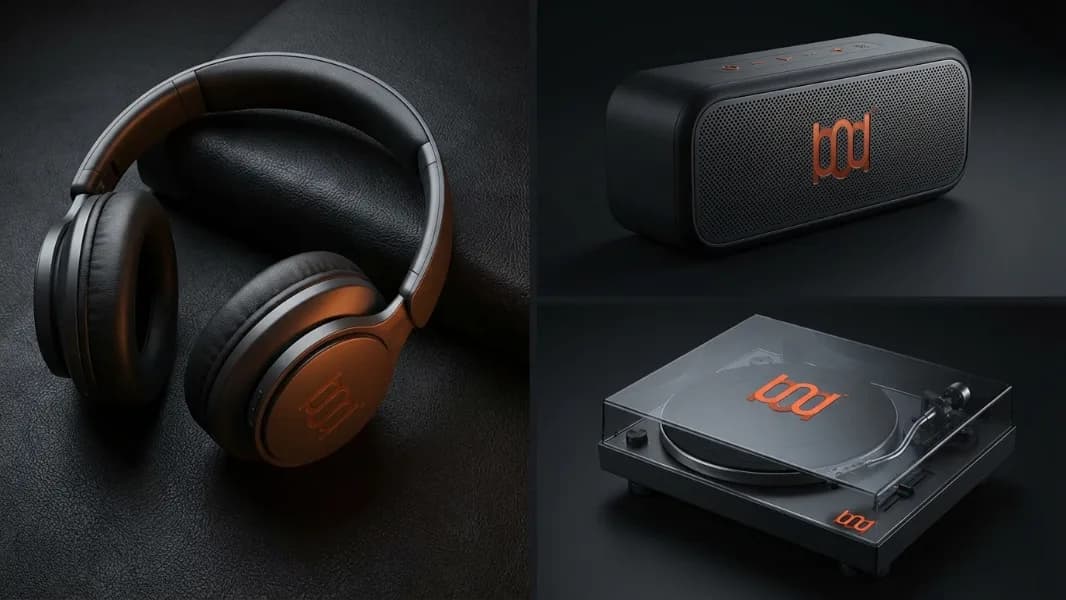
Each product gets its own close-up.
Individual shots isolate the headphones, speaker, and turntable, so the mark reads clearly at packaging and product-page scale.
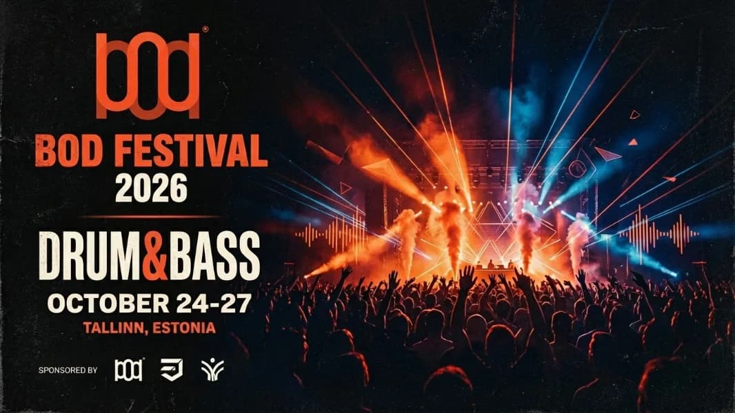
The identity extends to a live sponsorship.
A festival poster for Bod Festival 2026 shows the mark working as a sponsor lockup alongside other brand marks — proof the identity survives outside the product itself.
Identity system
A wordmark built to survive translation.
Pod is a self-directed concept for a music and podcast brand — one wordmark extended from an app promotional screen onto three hardware products and a festival sponsorship placement.
The project is presented as a self-directed concept study. No client relationship, user research, or measured commercial outcome is claimed.
Visual system
Void
#0B0A09
Base surface across app, product photography, and print — the mark is the only light source.
Ember
#F2611C
The identity's single accent, applied identically across app, merch, and the festival poster.
Ash
#8A8580
Secondary text and muted UI chrome.
One accent, everywhere. The same burnt-orange runs through the app promo, the merch photography, and the festival poster — no secondary accent colour appears anywhere in the material.
Current state
A brand concept, not a product roadmap.
This presentation covers a self-directed 2024 case study — app-promo art, product photography, and a sponsorship application for a music brand concept. It does not represent a commissioned engagement, a shipped app, or measured outcomes.
Digitek
Product Design / UX/UI / Enterprise UX