About the project
A book retailer's identity and digital product concept — a logo, an e-commerce app, a desktop storefront, and the style guide holding them together.
Concept study
2021
Identity, Web design, Mobile UX/UI, Art direction
E-commerce / retail
Design question
How can a digital identity behave more like a publication than a brand system?
Allecto is a self-directed 2021 concept for a book retailer — a logo, an e-commerce app, and a website, not a commissioned identity engagement.
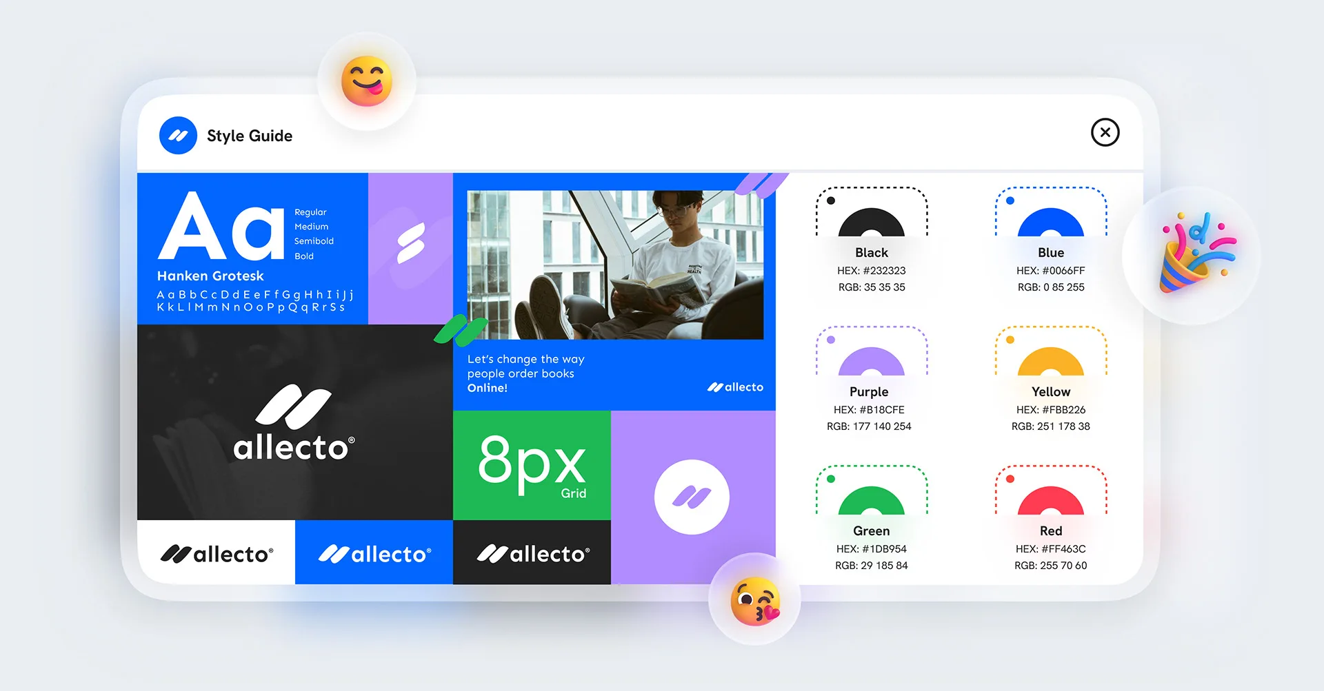
One wordmark, one grid, six colours.
Hanken Grotesk across four weights, an 8px grid, and a six-colour palette hold the identity together — with sample tiles showing how the mark sits on black, white, and a single accent blue.
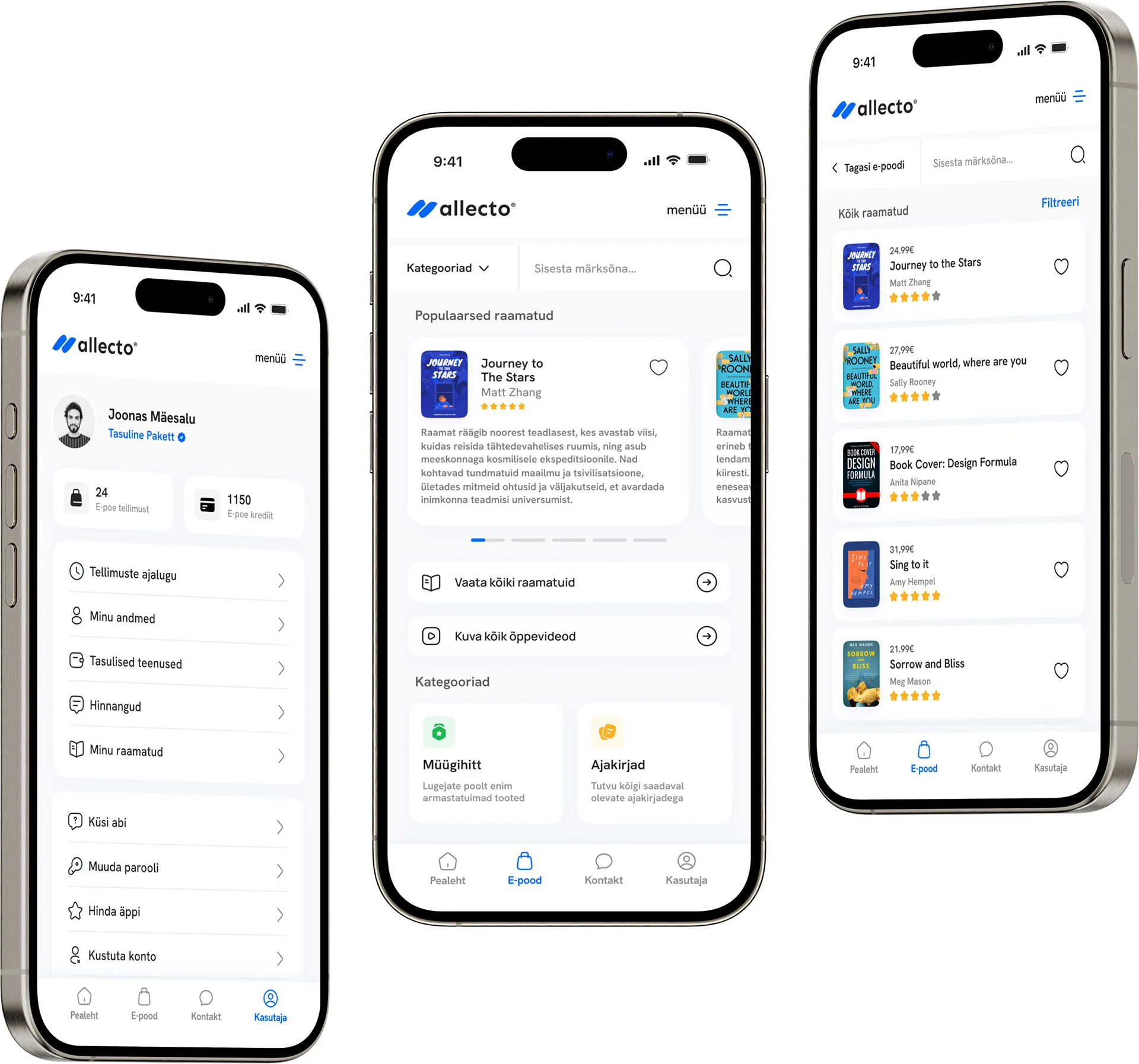
The identity carries into a full e-shop.
An account screen, a browsable home feed of popular titles, and a filterable catalogue extend the same wordmark and type system into a working mobile storefront.
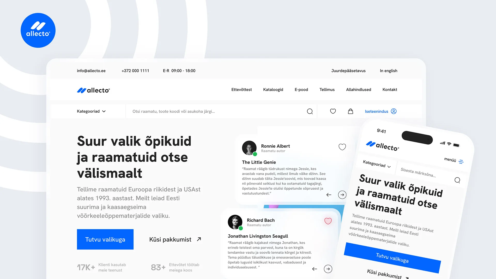
And a desktop storefront built on the same system.
The website leads with "A huge selection of textbooks and books, straight from abroad," paired with reader testimonials and a responsive mobile view of the same layout.
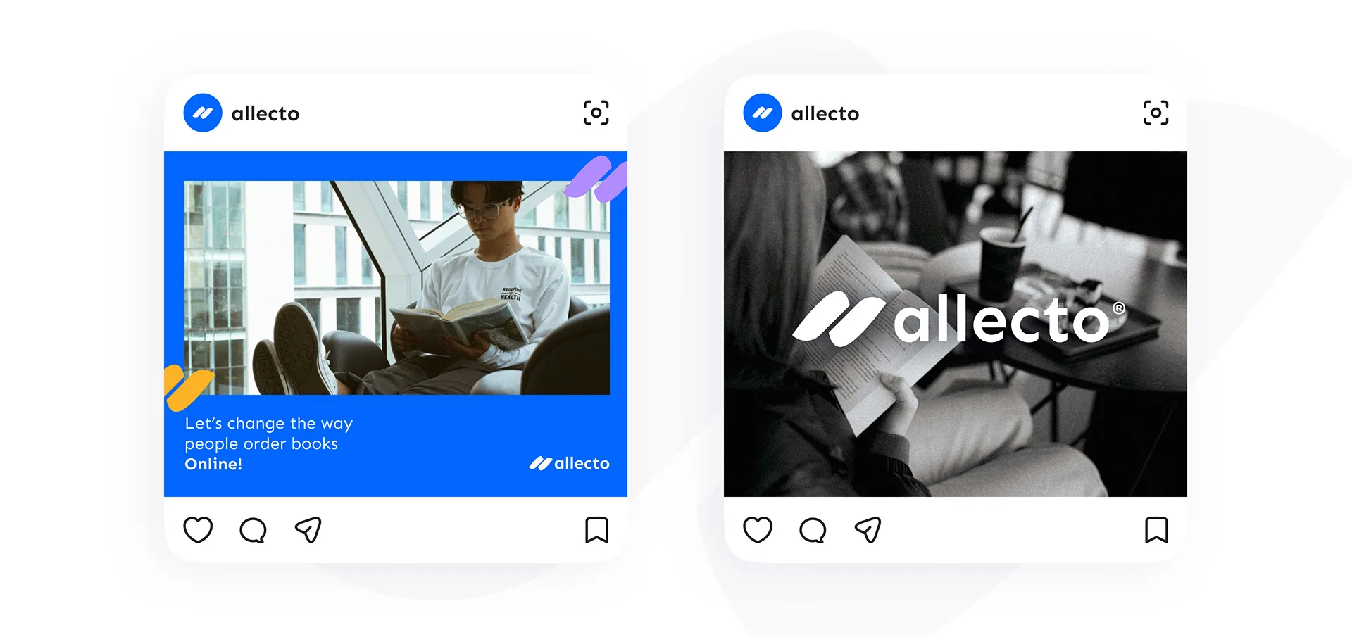
The wordmark holds up at social scale too.
A promotional tile and an editorial reading photo show the identity working as a marketing placement, not only as app and web chrome.
Identity system
A wordmark built to fill the frame.
Allecto explores an identity for a book retailer extended across a mobile app, a desktop storefront, and social placements — tied together by editorial-scale type and one dominant wordmark.
The project is presented as a self-directed concept study. No client relationship, user research, or measured commercial outcome is claimed.
Visual system
Black
#232323
Primary dark surface and default logo colour.
Blue
#0066FF
The identity's single accent — reserved for the wordmark, links, and calls to action.
Purple
#B18CFE
Secondary accent for highlights within dark surfaces.
Yellow
#FBB226
Supporting tone for category tags and iconography.
Green
#1DB954
Supporting tone for category tags and iconography.
Red
#FF463C
Supporting tone for category tags and iconography.
Interface
Aa
Hanken Grotesk
Regular through Bold across the wordmark, app, and website — one typeface carries every surface.
8px grid. Spacing across the app and website is built on an 8px base unit, kept visible as a rule in the style guide itself.
What the concept explored
A concept extended across brand, app, and web.
This presentation spans identity guidelines, a mobile e-commerce app, and a desktop storefront — still a self-directed study, not a system tested with real users or applied at a live retailer.
Pod® Cast
Identity / Branding / Product Design