
See what your website is missing.
A professional review of your design, UX, conversion, accessibility and performance — with specific, prioritized fixes.
One website · Human reviewed · No subscription
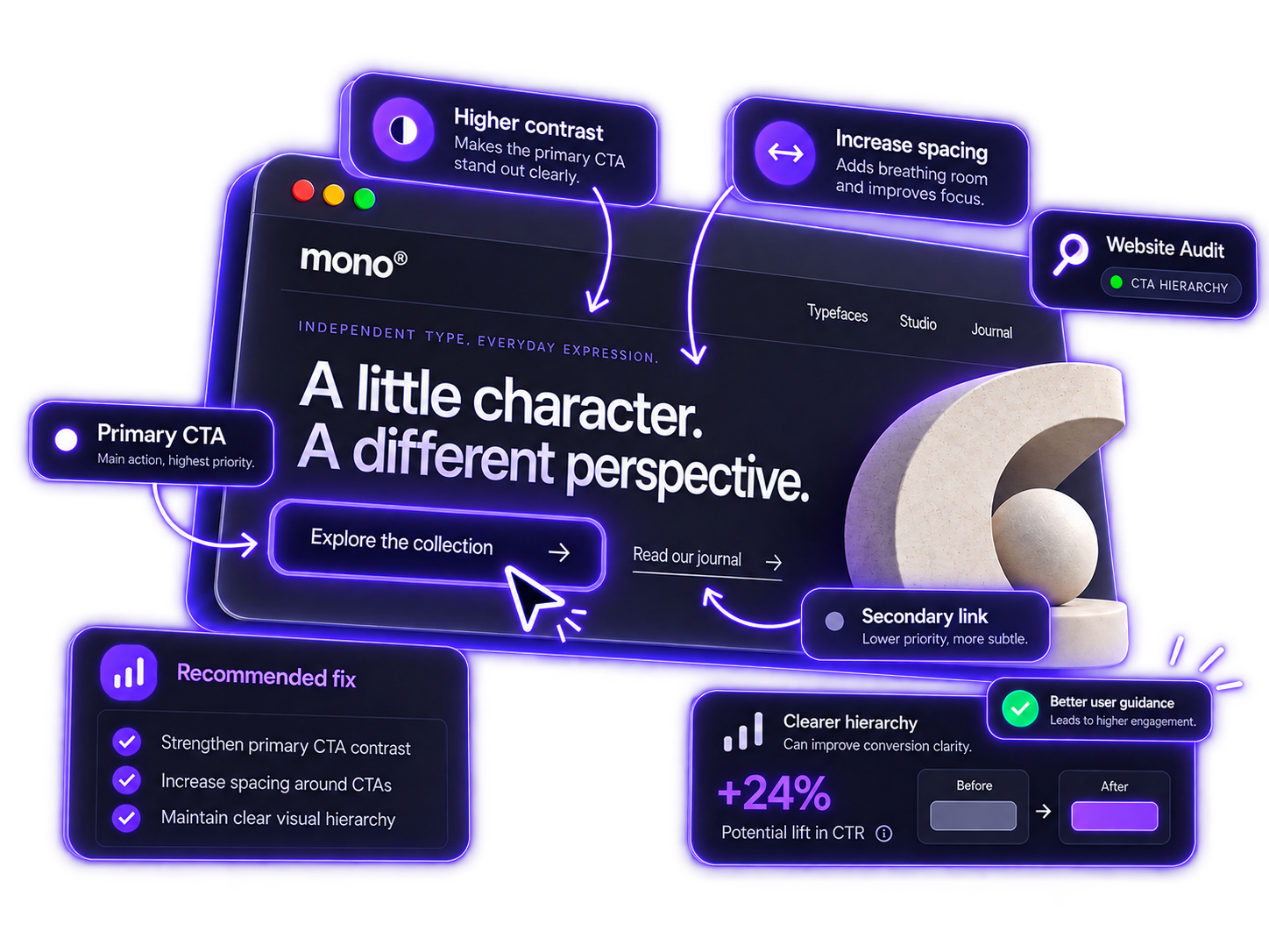
Your primary action exists.
It just doesn’t act like it.
“Explore the collection” and “Read our journal” share the same size, contrast and visual weight.
Visitors have to decide where to start before they can decide which typeface to buy.
Give the collection a filled, high-contrast button. Make the journal a quieter text link, with more space between the two.
Illustrative example · mono.example
Ten lenses.
One clearer picture.
We look at how the pieces work together, not just whether they pass in isolation. Each lens contributes a weighted share of the overall score.
Design & experience
Hierarchy, typography, colour and consistency.
Navigation, clarity and the path through your site.
Feedback, transitions and reduced-motion behaviour.
Growth & trust
Calls to action, decision points and friction.
The evidence people need before they commit.
What you say, how you say it, and what is missing.
Technical health
Layouts and interactions on smaller screens.
Contrast, readability, keyboard access and semantics.
Loading behaviour and the weight of your pages.
Metadata, structure and discoverability.
A report you can
actually work from.
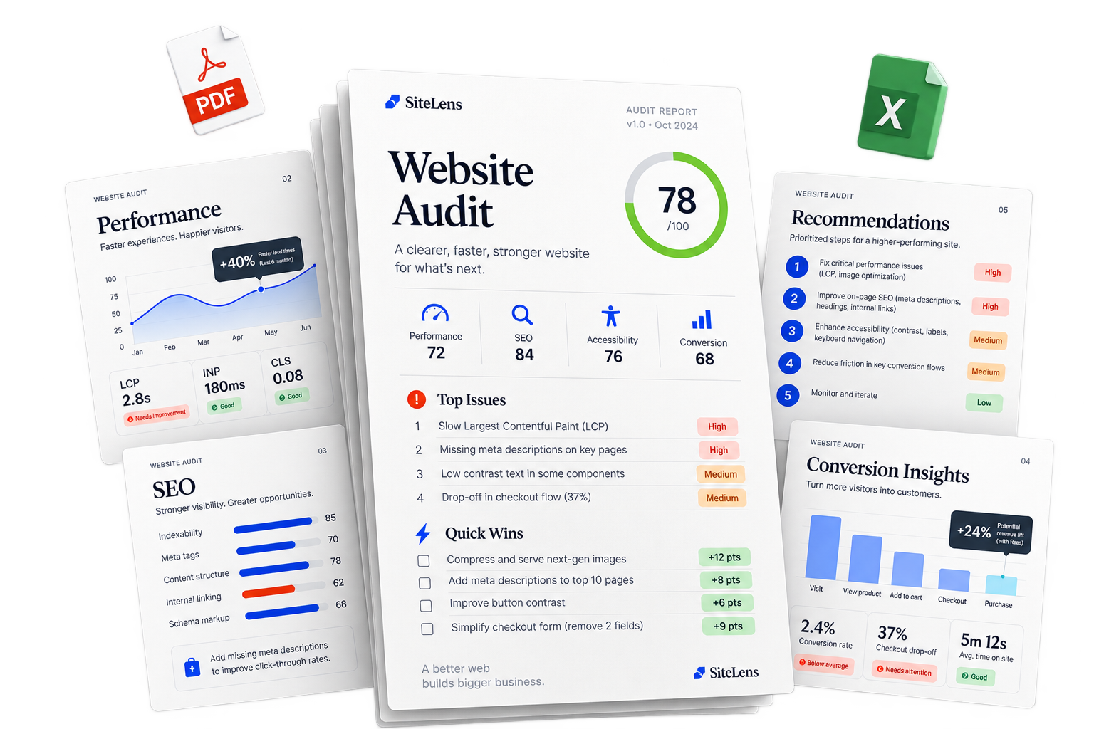
The score is the starting point. The value is knowing what is wrong, why it matters, and what to do about it.
Find the problem.
Then fix it.
Selected findings include implementation-ready prompts. Take a specific recommendation into Codex, Claude Code or Cursor — with the context already written.
Use with your codebase. Review and test every change.
Restore the hero’s hierarchy.
Two calls to action carry equal visual weight, so visitors hesitate before either one.
Make “Explore the collection” read as the one obvious next step.
- Keep the existing destination and click behaviour for both actions.
- Use a solid, high-contrast button for the primary action. Make the journal link secondary.
- Keep both actions keyboard accessible with a visible focus state and 44px touch target.
- At mobile widths, place the primary action first. Verify neither label wraps.
You don’t need to
fix everything first.
Separate the changes that matter now from the work that can wait. Every recommendation has a place.
Strengthen hero CTA hierarchy
Move trust proof earlier
Simplify mobile navigation
Improve hero loading
€99
Professional
Website Audit
A considered review of one website. A practical plan for making it better.
- Desktop + mobile review
- Visual design, UX + conversion
- Accessibility + performance
- SEO fundamentals
- Prioritized findings + quick wins
- Implementation prompts
- Human review
Start with clarity.
Take it as far as you need.
Professional Website Audit
Understand what needs attention.
Audit + Redesign Concept
See a new direction take shape.
Implementation
Put the recommendations to work.
Full redesign / development
Build the next chapter with UXUI.