OONA
Dental clinic / Booking website
A premium dental booking website built around clarity, trust and informed choice.
- template
- €690
- customized by UXUI
- From €2,800
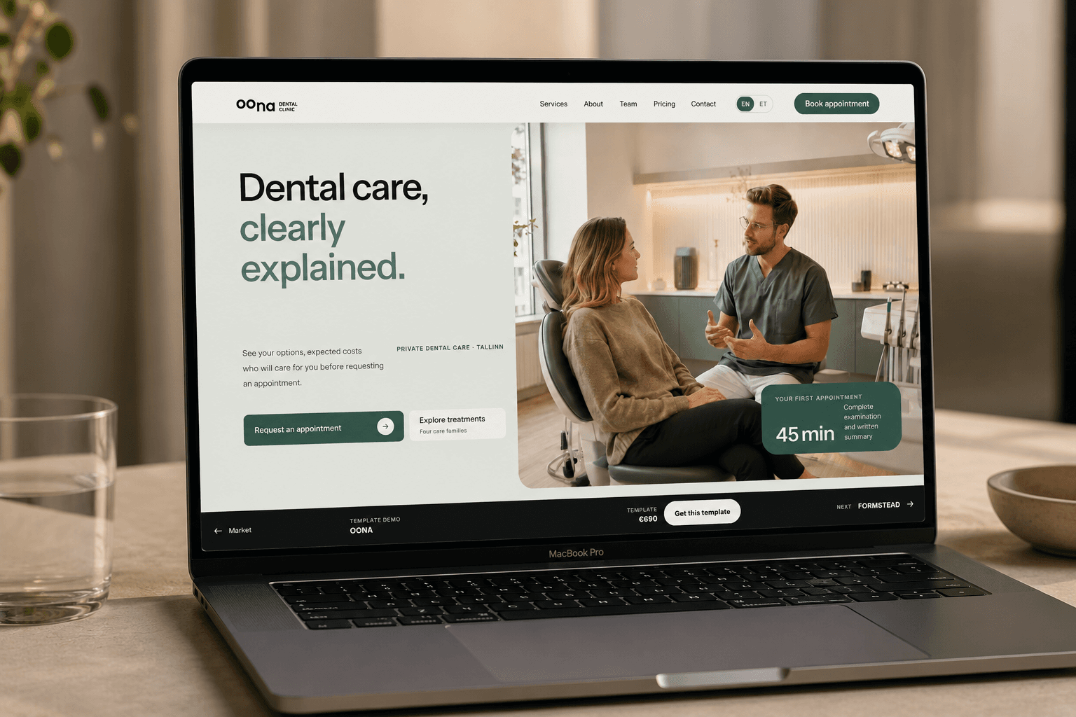
OONA is built for private dental clinics that need a clear, professional website with booking at the centre of the experience. The template provides a ready-made structure for treatments, clinicians, pricing guidance, practical clinic information and appointment enquiries. UXUI can adapt the brand, content and booking workflow before launch.
Best for
- Private dental clinics
- Specialist dental practices
- Cosmetic and restorative dentistry
- Small multi-clinician practices
What you’ll get
Every page and feature below is part of the live demo, so you can try it before you choose.
Pages included
- Homepage and patient pathways
- Treatment directory
- Specialist profiles
- Price guidance
- Urgent dental care
- Booking and contact
- Location and visit planning
Built-in features
- Need-led treatment navigation
- Transparent ZIP template price
- Fictional specialist profiles
- Urgent-care guidance
- Treatment price ranges
- New-patient appointment flow
- Native FAQ interactions
- Hours, access and location
- Mobile booking action
Two ways to have it
€690
Launch it yourself. A one-time price for the complete website.
- Built on Next.js
- All 7 pages listed above
- Every built-in feature listed above
From €2,800
UXUI adapts it to your business, then builds and launches it for you.
Everything in the template, plus UXUI’s work on:
Brand
- Clinic brand and visual identity
Content
- Treatment and price catalogue
- Team profiles and photography
Function
- Booking provider integration
- Patient forms and consent flows
- CMS and multilingual setup
- Analytics and launch support
How buying works
Start with an inquiry. We reply within a day or two.
- Delivery
Code handover. You receive the project files and launch the site yourself.
- Licence and support
Confirmed for your project in our reply to your inquiry.
- Customization timeline
Typically 3–6 weeks from agreed scope to launch.

How it’s thought through
Find the right care first
The homepage opens with one headline, one primary action and a call-us fallback — not a navigation wall. "Book an appointment" stays the single obvious next step.
Browse care by need, not terminology
Treatments are grouped as Preventive, Restore, Replace and Refine, each with a real price range and duration shown on the card itself — no separate page to find the number.
See who treats you, and what it costs
Clinicians are named and credentialed by specialty, each individually bookable. The pricing table that follows lists six real procedures with a note on what changes the final number.
Move from question to appointment, on any screen
The same three-step booking form — reason, details, notes — holds its structure from desktop down to a 390px phone, with the reduced-motion, real-select-element inputs intact.
Practical information stays in the same block
Address, opening hours and contact details sit together in one section next to the map, so a confirmed patient never has to hunt through the footer for them.
Design system
OONA runs on a warm off-white base with a single clinical green reserved for booking actions and price emphasis. Headings share UXUI's own Outfit and DM Sans pairing.
- Ink#1C1B19Primary text
- Base#FBFAF7Base canvas
- Surface alt#F4F1EASection surfaces
- Accent#2F8F76Booking actions
- Accent tint#E3F3EESoft badges & backgrounds
Typography
- DisplayOutfit
- HeadingOutfit
- BodyDM Sans
- LabelOutfit
Surfaces use a consistent radius scale (10–28px) and one soft two-layer shadow, shared by cards, photo frames and the booking form.