About the project
A bold identity and website for a print and packaging studio, built around the physical product catalogue instead of a generic service menu.
Overview
A print studio that leads with the physical product.
NOTA needed a website that could sell posters, packaging, stickers and print work with the same confidence as the objects themselves — not a generic service-agency layout wrapped around stock icons.
One accent, held in reserve.
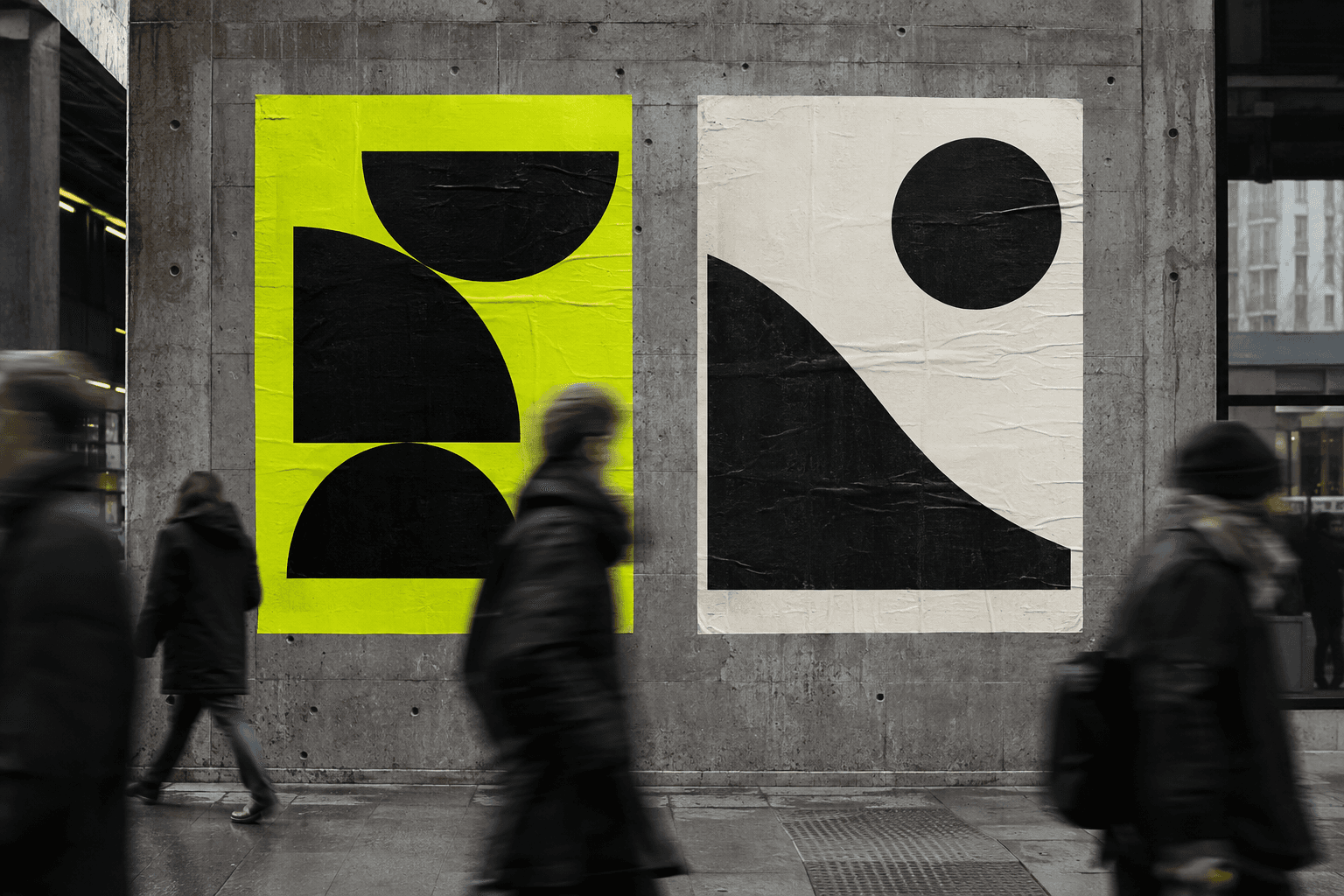
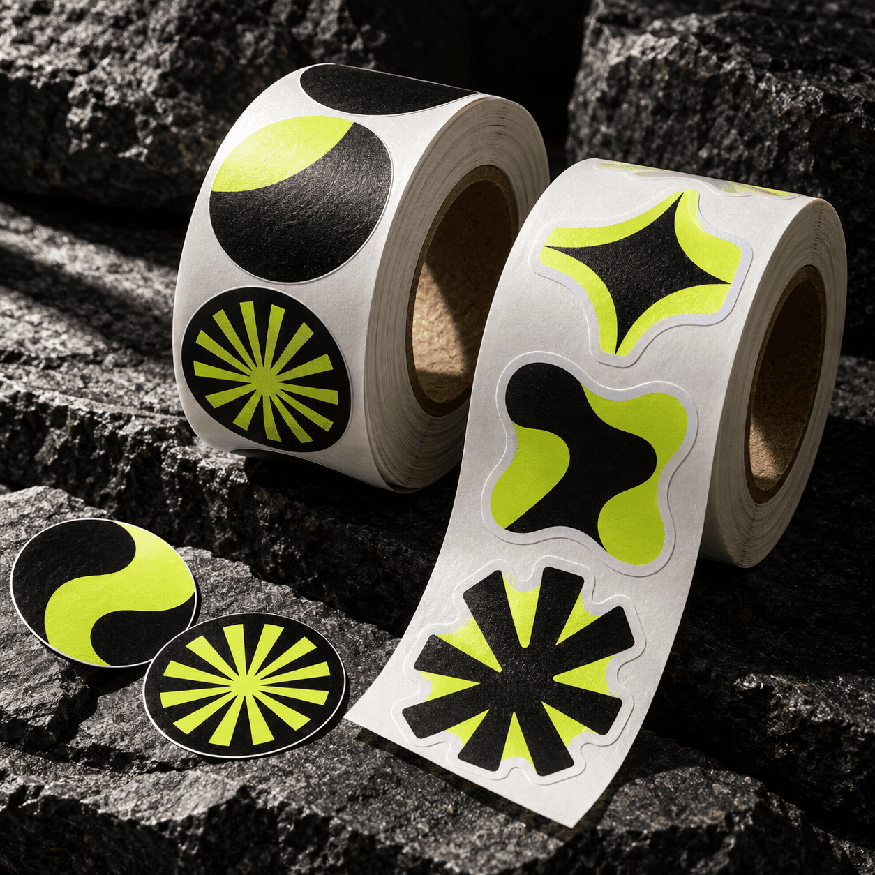
A near-black base and a single acid-lime accent carry the entire system — reserved for calls to action, links and emphasis, never used as decoration.
Catalogue
The product carries the page.
Structure
Selling a catalogue, not a service menu.
Posters, packaging, stickers, labels and more sit in one scannable grid on the homepage, each card naming the format, surface and finish instead of vague service language.
Industries served — retail, hospitality, events, agencies — each get a dark, image-led tile naming the exact outputs that field actually orders, so the site reads as a catalogue first and a pitch second.
Principles
What the system had to hold to.
Product first. Photography of the physical output leads every section, not illustration or iconography.
Bold restraint. One accent colour, held back for action and emphasis rather than spread across the page.
Legible process. A four-step production sequence gives a buyer a clear mental model before they request a quote.
Flat surfaces. No rounded corners or drop shadows anywhere — a sharp, industrial, print-shop tone.
System
The palette and type.
Display
Barlow, uppercase
Headlines and hero type
Body
Barlow
Body copy and interface labels
Surfaces
No rounded corners or drop shadows anywhere in the interface, reinforcing the industrial print-shop tone.
Before / after
Before. A generic print-shop template — pill buttons, stock icon rows, a centered hero with no point of view.
Now. An oversized-type, lime-accented identity built around the product catalogue, the industries served, and a legible production process.