About the project
Ripple explores whether one banking app can serve someone who already trades crypto and someone who never wants to, without turning either into an afterthought — built out through two personas, competitor benchmarking, and a working interface.
Self-directed concept
2025
UX research, Competitive analysis, Mobile UX/UI, Visual system
Financial technology
The scenario
One financial home for two levels of complexity.
Traditional banking rewards familiarity. Crypto products reward expertise. Most apps make a user pick a side before they've even opened an account. Ripple is a self-directed 2025 concept that assumes both can live in one product — built out through personas, competitor research, and interface screens, not a commissioned engagement.
Show the cost before you ask for trust.
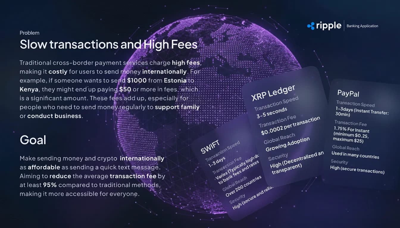
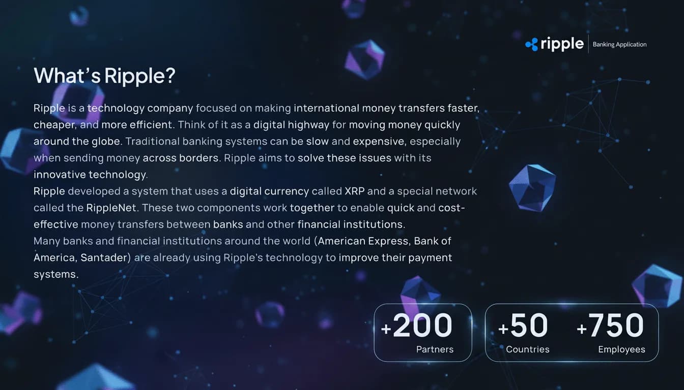
Sending $1,000 from Estonia to Kenya through traditional rails can still cost $50 or more in fees — a cost most people only discover at the end. The concept's premise: settle through the XRP Ledger instead of SWIFT, and show that saving upfront rather than as a surprise at checkout.
Two people, one product
Two very different comfort levels with the same money.
Tim, 32 — crypto-native. Already trades crypto elsewhere and wants it merged with everyday banking, not bolted onto it — strong security, FaceID or QR payments, no separate login to remember.
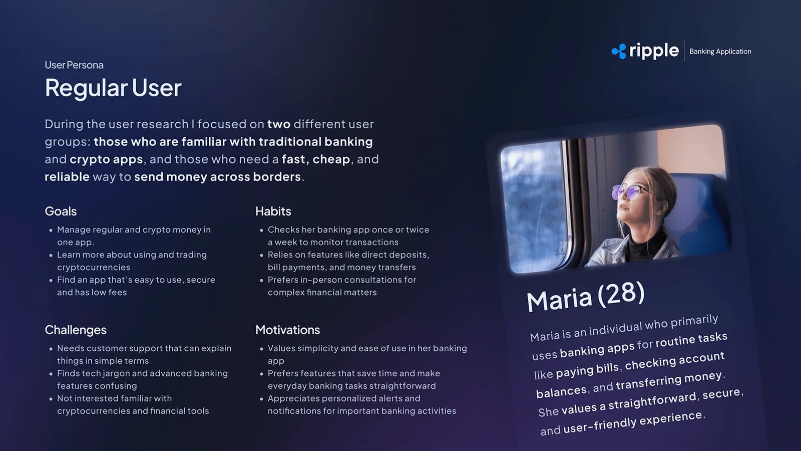
Maria, 28 — everyday banking. Opens her banking app once or twice a week for bills and transfers. Crypto jargon and extra settings are a reason to close the app, not a feature.
The shared constraint. Both personas wanted the same speed and the same low fees — they just needed to reach them through very different amounts of detail.
Research artifacts
Personas kept the interface honest.
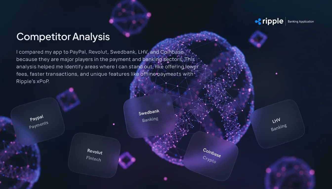
The gap wasn't a missing feature. It was hidden cost.
PayPal, Revolut, Swedbank, LHV, and Coinbase were mapped on fees, speed, and reach — not to find a feature to copy, but to confirm that lower, visible cost was still open ground, alongside an offline-payment option (xPoP) none of the five offered.
Three decisions
What the tension between Tim and Maria decided.
Familiar first. The account balance stays the anchor of the home screen for every user, crypto-native or not — nothing about the primary view assumes the visitor already trades.
Crypto on demand. Market detail sits one layer down. A user who wants a Fear & Greed index and asset breakdowns reaches it in a tap; a user who doesn't never has to see it.
Show cost before commitment. Fees and network are named before a payment is confirmed, not summarised afterward — the same rule Ripple used to judge its five competitors.
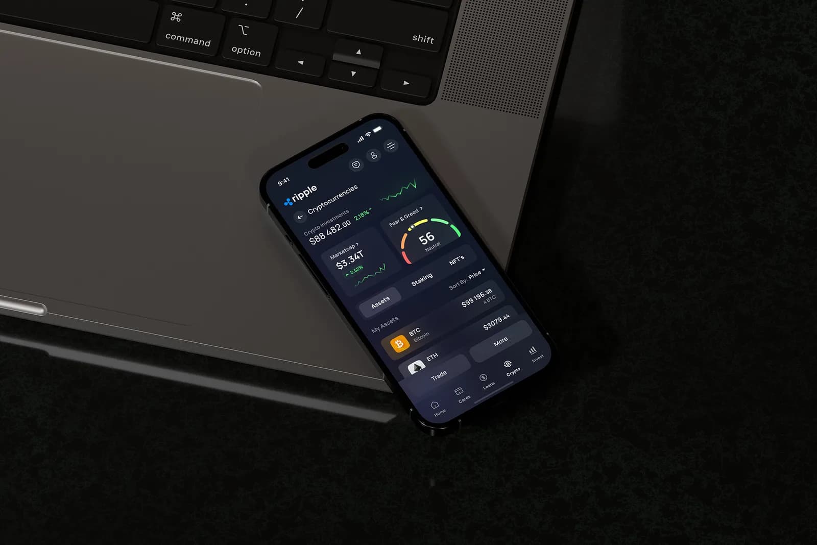
One balance, not two apps.
The Cryptocurrencies screen sits inside the same navigation as everyday banking rather than a separate tab bolted on afterward. Market cap, a Fear & Greed index, and held assets like BTC and ETH become detail a curious user opts into — not a second product they have to learn.
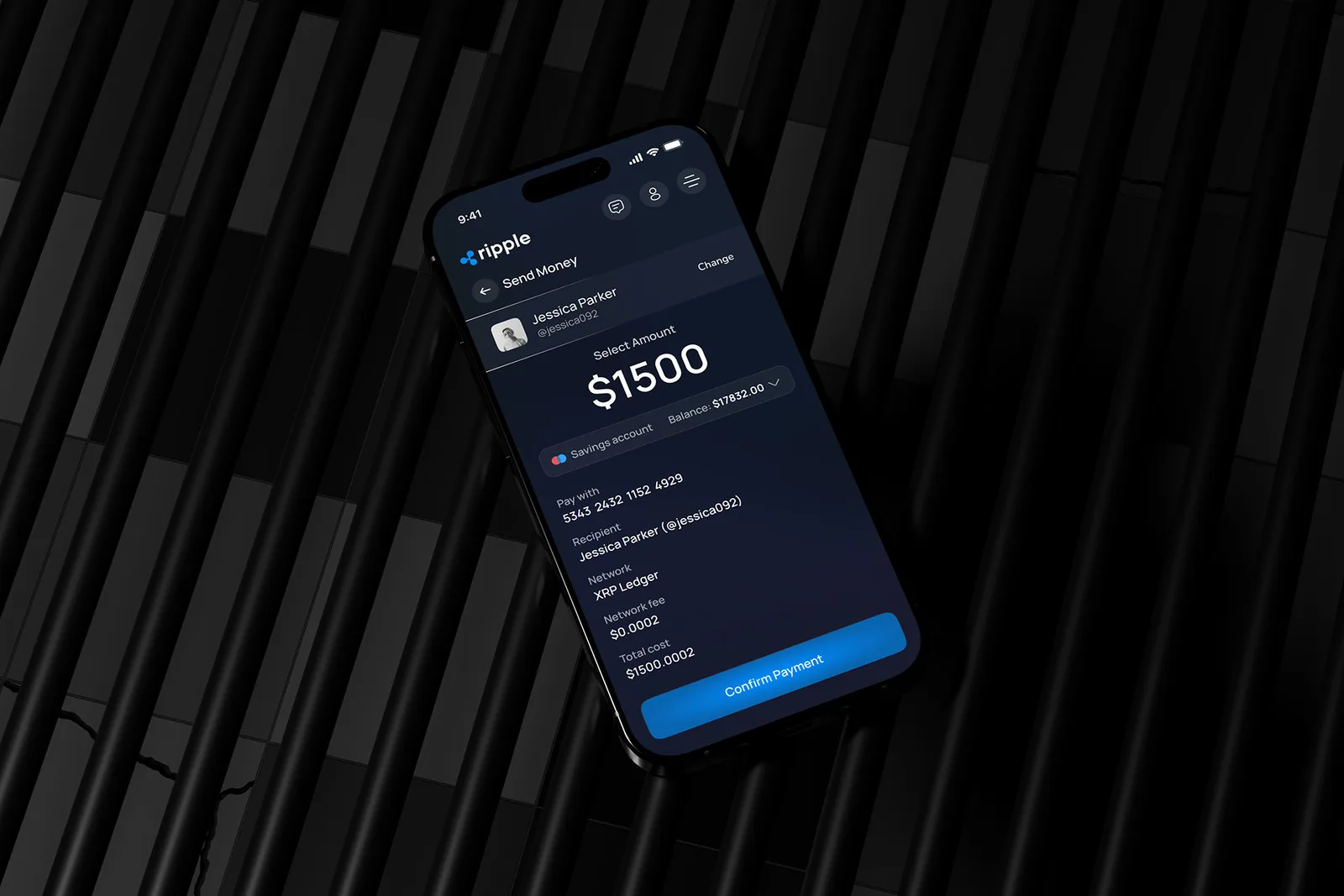
A send-money flow that reads like a receipt, not a leap of faith.
Recipient, network, fee, and total cost — down to $0.0002 in network fees on the XRP Ledger — are shown before a single tap confirms the payment. If the goal is trust, the fee has to be legible before the money moves, not after.
Visual system
What changed
Before. Managing everyday banking and crypto usually means two logins, two fee structures, and two mental models — one for spending, one for trading.
Now. This concept keeps both inside one balance, one login, and one confirmation flow — with the network and fee named upfront, not buried at checkout.
What this concept tests
Whether one interface can serve both comfort levels without diluting either.
This presentation covers a self-directed 2025 UX case study — personas, competitor research, and interface screens for a banking-plus-crypto concept.