
The best legal website design does three things in the first five seconds: it proves the firm is credible, it makes contact frictionless, and it satisfies the technical and ethical rules that govern how lawyers can present themselves online. Everything else, the color palette, the stock photos, the clever tagline, is secondary. If a site nails authority, speed, and compliance, it will out-convert a prettier competitor almost every time.
TL;DR:
- Strong homepage hero sections should clearly state the practice area, include specific credentials or outcomes, and display an authority badge or rating upfront.
- Attorney bios need to be short, outcome-focused, and client-oriented, starting with a photo and ending with a direct contact method rather than exhaustive credentials.
- Sites must present case results within bar rules, separating factual summaries and disclaimers on dedicated pages, avoiding unverified claims or guarantees.
- Technical standards like fast load times, mobile-first design, and WCAG accessibility are critical, with structured data and AI-friendly content improving search and AI visibility.
- Core pages should include practice-area descriptions, attorney bios, contact options, and an FAQ or blog, with simple forms and clear CTAs that are immediately visible on the first screen.
Table of Contents
- What Makes Legal Website Design Effective for Law Firms?
- What Design Principles Should Guide Every Legal Website?
- What Technical Standards Should a Law Firm Website Meet?
- Which Pages and Intake Features Actually Drive Leads?
- How Long Does a Law Firm Website Redesign Take?
- How Does UXUI Approach a Law Firm Website Project?
- How Do You Keep Client Data Secure on a Legal Website?
- How Often Should Legal Website Content Be Reviewed for Accuracy?
- How Should a Legal Website Connect to Practice Management Software?
- The Real Gap in Most Legal Website Advice
- Get Your Law Firm Website Evaluated by UXUI
- Sources
- FAQ
What Makes Legal Website Design Effective for Law Firms?
You don’t have to guess what works. Roundups of top-performing sites keep surfacing the same handful of patterns, and the SEO For Law Firms research on conversion-focused layouts confirms it: authority-first hero sections, humanized attorney profiles, and cleanly structured practice pages show up again and again in the firms that generate the most qualified leads. None of this requires copying a specific competitor. It requires understanding why these motifs work, then adapting them to your own practice.
Authority-first hero sections. The top third of a homepage should answer one question before the visitor scrolls: “Can this firm handle my problem?” A strong hero combines a headline naming the practice area or outcome (“Estate Planning That Protects What You’ve Built” beats “Welcome to Smith & Associates”), a subhead that adds specificity (years in practice, a notable credential, a jurisdiction focus), and one piece of immediate proof, a bar association badge, a client rating, a recognizable case type. Clio’s roundup of standout law firm sites shows this pattern consistently outperforming generic “About Our Firm” openers.
Attorney spotlight patterns that humanize without oversharing. Visitors hire people, not letterhead. But a bio page stuffed with a full CV, every conference attended, every publication, buries the one thing a prospective client actually wants to know: has this lawyer handled a case like mine? A well-designed bio leads with a photo, a one-line specialty statement, then two or three sentences on relevant outcomes or experience, followed by a direct contact link. Save the exhaustive credentials for a collapsible section or a linked PDF.
Case results presented within bar rules. This is where a lot of firms stumble. Many state bar associations restrict how outcomes can be described, banning language that implies a guaranteed result or omits necessary context. The safest design pattern separates factual case summaries (charges, general outcome type, jurisdiction) from any implied promise and pairs every results page with a visible disclaimer. Structurally, this usually means a dedicated “Case Results” or “Notable Outcomes” page rather than sprinkling unverified claims across service pages, which is easier to keep consistent and easier for compliance review.
CTA and contact placement that converts in the first screen. The firms that generate the most calls put a phone number in the header, a “Free Consultation” or “Contact Us” button in the hero, and a secondary contact option (chat, form, text) visible without scrolling. On mobile, this usually means a sticky call button in the thumb zone. Burying contact information in a footer is one of the most common and costly design mistakes on legal sites.
A short checklist of the micro-patterns worth stealing:
- A visible bar admission or certification badge near the header or footer, not buried on an “About” page.
- Short-form testimonials (one or two sentences, attributed by first name and case type where ethically permitted) rather than long unattributed quotes.
- “What to Expect” microcopy near intake forms (“We respond within one business day” or “This consultation is free and confidential”) that reduces anxiety before someone submits a form.
- Trust marks positioned near, not just present, forms and CTAs, since proximity matters more than presence.
- A clear practice-area menu in the primary navigation, not nested three clicks deep.
Pro Tip: Run a five-second test on your own homepage: show it to someone unfamiliar with your firm and ask them to name your practice area and one way to contact you. If they can’t answer both within five seconds, your hero section needs work before anything else on the site does.
What Design Principles Should Guide Every Legal Website?
Good legal website design isn’t a collection of trends. It’s a small set of principles applied consistently, and most firms violate at least one of them without realizing it.
Visual hierarchy should mirror decision-making, not org charts. Visitors don’t care how your firm is structured internally. They care whether you handle their specific problem. That means practice areas, not partner names, belong at the top of your navigation and your homepage hierarchy. Headline clarity matters more than clever phrasing: a visitor scanning your site for three seconds should know what you do and who you do it for.
Write bios for clients, not for peers. This is one of the most consistently underestimated principles in legal marketing. A bio written to impress other lawyers, dense with case citations and CV language, actively repels the people you’re trying to reach. MyCase’s research on lead generation found that shorter, outcomes-focused attorney profiles with clear contact options increase trust and contact rates more reliably than long, credential-heavy pages. Keep bios to a few short paragraphs, lead with what the lawyer solves for clients, and end every bio with a direct way to reach that specific attorney.
Color, typography, and whitespace signal competence before a single word is read. Dense, cluttered pages read as disorganized, and disorganization is the last impression a legal client wants. Generous whitespace, a restrained color palette (usually one primary color plus a neutral gray scale), and a single readable typeface for body text all communicate control. Flashy gradients and stock “gavel and scales” imagery, by contrast, read as generic and slightly dated to most visitors.
Consider the two paths side by side:
| Design choice | Signals competence | Signals amateur or risky |
|---|---|---|
| Practice-area navigation | Clear, client-first menu labels | Menu organized by attorney name only |
| Case results | Factual summaries with disclaimer | Unqualified “we win” claims |
| Bio length | Short, outcome-focused, 2 to 3 paragraphs | Full CV with no summary |
| Testimonials | Short, specific, properly attributed | Vague, unattributed, or stock-sounding |
| Typography | One clean typeface, high contrast | Multiple decorative fonts, low contrast |
Ethical framing of case results, testimonials, and awards deserves its own paragraph because it’s a compliance issue, not just a design one. Every jurisdiction has its own advertising rules, and award badges, “Super Lawyer” style recognitions, and client testimonials all fall under them. The safe design default is to disclose the basis for any award or rating near where it appears, avoid implying a guaranteed outcome anywhere on the site, and route the exact wording of any results or testimonial page past whoever handles your firm’s compliance review before launch. Building this into design, rather than fixing it after launch, is far cheaper.
What Technical Standards Should a Law Firm Website Meet?
Technical performance is where most legal websites quietly lose clients they never know they lost. A slow site or a broken mobile layout doesn’t announce itself. It just makes people leave.
Four priorities matter more than the rest:
- Speed. Core Web Vitals, Google’s measures of loading speed, responsiveness, and visual stability, should guide every technical decision. Compress images, limit third-party scripts (chat widgets and analytics tags are common offenders), and avoid heavy animation libraries on pages that don’t need them.
- Mobile-first layout. Most legal searches now start on a phone, often after an urgent event. Design the mobile layout first, not as an afterthought, and place primary CTAs within thumb-reach at the bottom third of the screen.
- Accessibility. WCAG 2.1 AA is the accessibility standard worth targeting. It covers color contrast, keyboard navigation, and screen-reader compatibility, and meeting it reduces both legal exposure and the number of visitors who simply can’t use your site.
- Structured data and AI-friendly content. The American Bar Association’s guidance on modern law firm websites frames today’s site as a 24/7 intake engine that needs to work for both human visitors and AI systems. Schema markup (LocalBusiness, Attorney, FAQPage) helps search engines understand your content, and pages that open with a concise summary and use descriptive headings are more likely to be surfaced or quoted by generative AI tools.
| Technical area | Minimum target | Why it matters |
|---|---|---|
| Page load (mobile) | Under 3 seconds for largest content | Slow pages lose visitors before the pitch even loads |
| Accessibility | WCAG 2.1 AA | Reduces legal risk, expands reachable audience |
| Structured data | Schema for LocalBusiness, Attorney, FAQ | Improves search and AI visibility |
| Mobile CTA placement | Within thumb zone, sticky on scroll | Directly lifts call and form conversions |
Which Pages and Intake Features Actually Drive Leads?
A law firm site needs a specific, minimal set of pages, and each one has a job. MyCase’s guidance on essential pages backs the same core list most conversion-focused firms settle on: a homepage that states practice areas and proof of credibility, individual practice-area pages that answer “what happens if I hire you for this specific problem,” attorney bio pages written for clients, a contact page with multiple channels, and a blog or FAQ section that builds ongoing search visibility.
Intake design deserves more attention than most firms give it. Forms with more than five or six fields see meaningfully lower completion, so ask only for name, phone or email, a one-line case description, and a preferred contact method. Offer at least two contact channels beyond the form, phone and either chat or text, since urgency varies by practice area. After submission, a confirmation screen or automated email stating a response timeframe reduces the anxiety that causes people to call a competitor while waiting.
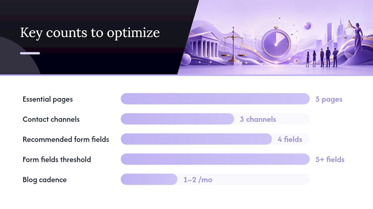
Content cadence matters more for legal sites than most industries realize. Regularly publishing SEO-optimized updates to a firm’s blog helps position the site as a reliable, current information source, which search engines and AI systems both reward over time. A realistic cadence for a small firm is one to two substantive articles per month, tied to actual practice questions rather than generic legal news.
A few conversion elements worth tracking once the site is live:
- Form conversion rate (submissions divided by unique visitors to the contact page).
- Phone-call lift after adding a sticky mobile call button.
- Page load time on mobile, since every additional second tends to reduce form completions.
- Bounce rate on practice-area pages, which often signals a mismatch between search intent and page content.
Pro Tip: If you only fix one thing on your intake form, cut it to four fields. Most firms lose more leads to a long form than to weak copy.
How Long Does a Law Firm Website Redesign Take?
A realistic legal website project moves in four phases, and firms that skip the discovery step almost always end up redoing work later.
- Audit and discovery (1 to 2 weeks). This phase should produce a scored assessment of homepage clarity, attorney bio effectiveness, practice-area depth, contact friction, page speed, and accessibility, the same categories a structured website audit is built to evaluate.
- Content and design (2 to 4 weeks). Copy for bios and practice pages gets drafted (ideally with compliance review built in), and wireframes move to full visual design.
- Development, QA, and launch (2 to 4 weeks). This includes accessibility testing, mobile QA across devices, and structured data implementation before the site goes live.
- Post-launch tuning (4 to 12 weeks). Analytics reveal where visitors drop off, and a staged launch approach, shipping a solid minimum viable site first and layering in features afterward, lets firms start measuring intake impact immediately rather than waiting for a perfect launch.
Each phase needs a named approval checkpoint, usually the managing partner or marketing lead, so revisions don’t stall the schedule.
How Does UXUI Approach a Law Firm Website Project?
UXUI builds around minimizing handoffs between strategy and execution, so the vision set during discovery survives all the way to launch instead of getting diluted at each transition. That methodology combines product thinking with design execution and leans on persona research to make sure a site reflects how real clients search and decide, not just how a firm wants to be perceived.
The Allecto project is a useful example of that process in practice: discovery and persona work shaped the structure before any visual design began, and the interface was built to carry that research through to the finished product rather than reworking it after the fact.
The strongest legal websites aren’t the ones with the most features. They’re the ones where every screen still reflects the same decisions made on day one of discovery, because nothing got lost in translation between strategy and build.
A short checklist drawn from that practice, applicable to any firm managing its own redesign:
- Start with persona research, even informal client interviews, before touching visual design.
- Keep the same team or a tightly briefed one across strategy and execution to avoid vision drift.
- Score the current site against a structured audit before deciding what to keep.
How Do You Keep Client Data Secure on a Legal Website?
Security on a law firm site is not optional polish. It’s a direct extension of confidentiality obligations that already govern how lawyers handle client information offline.
Start with the basics that too many sites still skip: enforce HTTPS across every page, not just the contact form, and use a current TLS certificate rather than an expired or self-signed one. Any intake or contact form that collects case details should transmit that data through an encrypted connection and store it in a system with restricted access, not a shared inbox everyone at the firm can see.
Third-party scripts deserve real scrutiny. Chat widgets, analytics tools, and marketing pixels can all create data exposure if they’re logging form content or page details you haven’t reviewed. Audit every plugin and script for what data it collects, and remove anything that isn’t earning its place.
Hosting matters too. Choose a host or content management platform with a documented security update process, since an outdated plugin is one of the most common ways law firm sites get compromised. Back up the site regularly and test that backups actually restore, not just that they exist.
Finally, treat any client portal or document-sharing feature as its own security review. If clients upload sensitive documents through the site, that feature needs authentication stronger than a simple form password, ideally two-factor verification, and clear data retention rules so old files don’t sit exposed indefinitely.
How Often Should Legal Website Content Be Reviewed for Accuracy?
Legal content ages faster than most firms plan for. Statutes change, case law shifts, and a practice-area page written two years ago can quietly become inaccurate without anyone noticing until a client or a bar reviewer catches it.
Set a recurring review cycle, at minimum annually for core practice pages, and immediately whenever a relevant law changes in your jurisdiction. Assign ownership: one attorney or paralegal per practice area should be responsible for flagging when their pages need an update, rather than leaving it to whoever last touched the website.
Every page that states a legal rule, a deadline, or a procedural detail should carry a visible “last updated” date. This does double duty: it protects the firm by showing good-faith maintenance, and it signals freshness to both readers and AI systems that weigh recency when deciding what to surface.
Build a lightweight version-control habit, even a simple changelog document, so if a claim on the site is ever questioned, the firm can show when it was written and when it was last verified. Pair this with the same compliance review process used for new pages: any edit that touches case results, testimonials, or claims of expertise should pass the same review a brand-new page would get, not a quicker version of it.
Content cadence and accuracy review are related but distinct. Publishing new blog content keeps the site visible in search and AI results. Reviewing existing pages keeps what’s already published defensible.
How Should a Legal Website Connect to Practice Management Software?
A law firm website that doesn’t talk to the tools running the practice creates extra manual work at exactly the moment speed matters most: right after a prospective client reaches out.
The most valuable integration is between the intake form and whatever practice management or client relationship system the firm already uses. When a form submission automatically creates a lead record instead of landing in an inbox someone checks twice a day, response time drops and fewer leads fall through the cracks. Most modern practice management platforms offer either a native form integration or a straightforward API connection that a developer can wire into the site during the build phase, not as an afterthought.
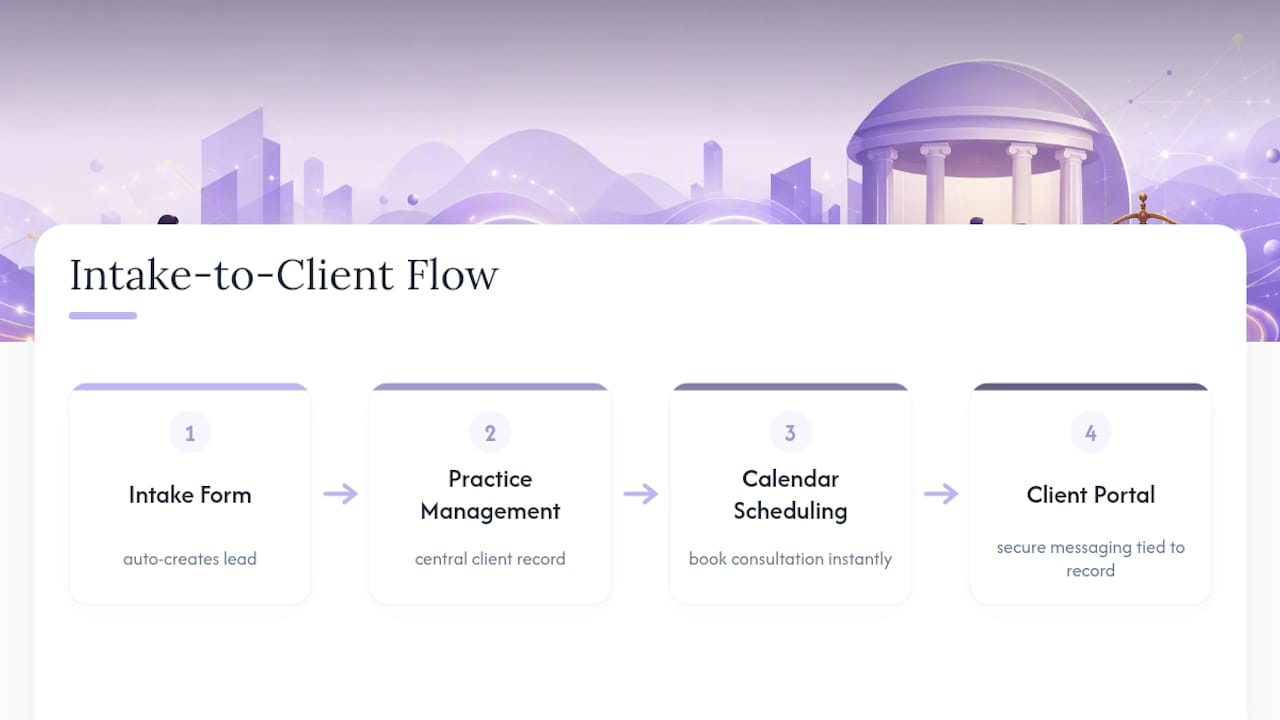
Calendar and scheduling integration matters almost as much. If a visitor can book a consultation slot directly from the contact page instead of waiting for a callback, conversion improves because the commitment happens in the same moment as the interest.
Client communication platforms, secure messaging or document portals, should connect to the same client record system the intake form feeds, so a prospective client’s information doesn’t live in three disconnected places by the time they become an actual client. This also reduces the number of systems handling sensitive data, which simplifies the security review discussed earlier.
When briefing a designer or developer, name the specific practice management and communication tools your firm already uses early in the discovery phase. Retrofitting integrations after launch almost always costs more than planning for them from the start.
The Real Gap in Most Legal Website Advice
Most legal website advice treats design and compliance as separate conversations, one for the marketing team and one for whoever handles bar rules. That split is the actual problem. The firms with the strongest sites treat compliance as a design constraint from day one, the same way they’d treat mobile screen width or brand color. A case-results page built with the disclaimer as an afterthought almost always looks like exactly that: an afterthought, bolted onto an aggressive claim someone had to walk back.
The conventional advice also overweights visual trends and underweights the boring technical layer. A gorgeous hero section on a site that takes four seconds to load on mobile is a wasted hero section. Prioritize speed, accessibility, and structured content before agonizing over typography choices.
If you take one thing from this, prioritize the intake path first: a fast, accessible, four-field form backed by a compliant results page will outperform a beautifully designed site with a buried contact button every time. Design polish should come after the mechanics work, not before.
— uxui
Get Your Law Firm Website Evaluated by UXUI
Uxui is the alternative to hiring a traditional agency for a law firm redesign: instead of an open-ended engagement, you start with a fixed-scope Professional Website Audit for 99 €, a scored assessment of homepage clarity, bio effectiveness, practice-area depth, speed, and accessibility, so you know exactly what needs fixing before committing to a full build. From there, an Audit + Redesign Concept for 249 € turns those findings into a concrete direction, and full Implementation starts from 499 €.
That staged approach matters because it minimizes handoffs between strategy and execution, the same methodology behind projects like Allecto. You get a discovery phase, a clear concept, and a build that carries the original vision through without diluting it at every transition. If your firm is weighing a full custom build against something faster, the UXUI Market templates offer production-ready starting points you can customize. Book the audit first and see the specific gaps in your current site before deciding how far to take the redesign.
This article is general information, not a substitute for advice from a qualified lawyer. Consult a qualified legal professional about your own circumstances before acting on anything here.
Sources
- Designing your law firm’s website — American Bar Association
- Law firm website design tips and best practices | MyCase
- Web design for law firms — The SEO For Law Firms
- Top 20 best law firm websites | Clio
FAQ
Is It Legal to Build Your Own Law Firm Website?
Yes, there’s no law preventing an attorney from building or self-publishing a website. The real risk isn’t legality, it’s compliance: every page, especially case results and testimonials, still needs to follow your jurisdiction’s advertising rules regardless of who builds the site.
Can ChatGPT or AI Tools Draft Legal Website Content?
AI tools can help draft first versions of practice-area descriptions or blog posts, but every claim about outcomes, credentials, or legal advice needs review by a licensed attorney before publishing, since AI-generated text can misstate law or imply guarantees your bar rules prohibit.
What Legally Needs to Be on a Law Firm Website?
At minimum, most jurisdictions expect a clear disclaimer that site content isn’t legal advice, accurate attorney licensing information, and any required advertising disclosures tied to testimonials, awards, or case results. Exact requirements vary by state bar, so confirm specifics with your jurisdiction.
How Do You Build a Website for a Law Firm From Scratch?
Start with an audit or discovery phase to map practice areas and client personas, then move through content and design (2 to 4 weeks), development and QA (2 to 4 weeks), and a staged launch followed by post-launch tuning. A Professional Website Audit is one way to start that process with a scored baseline rather than guesswork.
What Should Attorney Bio Pages Include?
An effective bio leads with a photo and a one-line specialty statement, follows with two or three sentences on relevant experience or outcomes, and ends with a direct way to contact that specific attorney, rather than a long CV-style list of credentials.