
Clarity, pricing transparency, and routing beat any other lever on a B2B SaaS site. A visitor decides whether to keep reading within 10 to 20 seconds, the median SaaS landing page converts around 3.8%, and most sites still force self-serve buyers and enterprise buyers down the same path. Fix the hero message, the pricing page, and the routing logic first. Everything else, including the visual polish, matters less than getting those three right. This article walks through the patterns that work, with examples worth copying and a measurement approach Uxui uses with its own clients.
TL;DR:
- Clear hero messaging with a subject, verb, and outcome improves visitor understanding within seconds and should be tested with real people.
- Designing for speed, outcome-focused proof, and tailored CTAs supports higher conversion rates, especially on the homepage and pricing pages.
- Building separate, targeted paths for self-serve and enterprise buyers prevents funnel confusion and aligns content with their specific needs.
- Prioritize fixing hero clarity, CTA friction, and pricing visibility during initial audits for quick, high-impact improvements.
- Incorporate trust signals at decision points, optimize for mobile, and use personalization based on role and company size to increase engagement and trust.
Table of Contents
- What Makes B2B SaaS Website Design Actually Convert?
- What Design Patterns Do the Best B2B SaaS Websites Use?
- How Should a SaaS Pricing Page Be Designed?
- How Do You Design a Site for Both Self-Serve and Enterprise Buyers?
- What Should You Measure Before Redesigning a SaaS Website?
- What’s a Practical 30/60/90-Day Plan for a SaaS Website Redesign?
- Where Should Trust Signals Go on a B2B SaaS Site?
- Does Mobile Design Matter for a B2B Software Website?
- How Do You Personalize a SaaS Website for Different Buyer Segments?
- How Does Visual Hierarchy Guide a Visitor Toward Conversion?
- Should a SaaS Website Include a Chatbot or Live Chat?
- Why Does Accessibility Matter for a B2B Software Website?
- Why Fewer Handoffs Change What a SaaS Website Can Become
- Ready to Turn These Patterns Into Your Own Site?
- Sources
- FAQ
What Makes B2B SaaS Website Design Actually Convert?
Four elements carry most of the weight on a B2B SaaS marketing site: a hero that states its case in one glance, proof placed where doubt naturally spikes, feature copy that leads with outcomes, and a page that loads fast enough to keep paid traffic from bouncing.
The hero should follow a simple formula: subject, verb, outcome. Name who the product is for, state what it does, and say what changes as a result. “Project management software for teams” tells a visitor nothing they didn’t already guess from the logo. “Finance teams close the books three days faster with automated reconciliation” tells them exactly why they should keep scrolling. Pair that message with a CTA split that respects intent: a primary “Start Free” button for self-serve evaluators and a secondary “Talk to Sales” link for buyers who need procurement, security review, or a custom quote.
- Place logos, review scores, or a security badge near the first CTA, not buried in a footer strip.
- Write feature sections around the result (“reduce onboarding time by half”) rather than a spec list.
- Treat Largest Contentful Paint as a business metric, not a developer concern. Slow paint kills paid traffic before the message even loads.
- Test one variable at a time on the hero. Two changes at once make it impossible to know which one moved the needle.
Pro Tip: Read your hero headline out loud to someone outside your company. If they can’t repeat back who it’s for and what it does, rewrite it before you touch anything else on the page.
What Design Patterns Do the Best B2B SaaS Websites Use?
Curated teardowns work better than abstract advice because they show the mechanism behind the conversion, not just the claim. Here are six patterns worth copying, each solving a specific problem.
- Immediate product preview. Instead of a generic hero illustration, some of the strongest SaaS homepages show the actual product interface above the fold. This removes the guesswork buyers face when evaluating unfamiliar software and shortens the path to “I get it.”
- Split CTA architecture. A two-button hero (self-serve trial versus sales conversation) prevents enterprise buyers from being funneled into a signup form they will never complete, and prevents self-serve users from being forced into a sales call they don’t want.
- Pricing anchor with a visual highlight. A recommended tier, set apart with a border or shading and often labeled “Most Popular,” reduces the mental math a buyer has to do and speeds up the decision.
- Embedded interactive demo. Letting a visitor click through a real workflow, instead of watching a video, builds trust faster because it proves the product works rather than asserting it.
- Outcome-first case study cards. Naming a specific result (“cut deployment time from six weeks to four days”) on the homepage, rather than saving it for a separate case studies page, keeps proof close to the decision point.
- Integration logos placed near the CTA. Showing that a tool connects to Salesforce, Slack, or a company’s existing stack answers a technical objection before it’s raised.
Curated example galleries and annotated teardowns work as a design reference precisely because they attach a reason to each pattern instead of just showing a screenshot.
How Should a SaaS Pricing Page Be Designed?
Limit the number of visible pricing tiers to a small number to reduce buyer comparison fatigue. Limiting visible pricing tiers and anchoring a recommended one reduces the comparison fatigue that stalls a purchase decision, and progressive disclosure (an expandable “compare all features” table below the fold) lets power users dig deeper without cluttering the main view for everyone else.
- Show exact prices for SMB-focused tiers where the buyer can self-serve a purchase decision.
- Use directional pricing (“starting at” or “custom”) for enterprise tiers that require a sales conversation, since exact numbers there tend to trigger premature comparison shopping.
- Visually anchor one tier as the recommended option using shading, a border, or a small label.
- Test toggle placement (monthly versus annual), tier order, and the wording on your CTA buttons. Track click-through rate on each tier and time-to-first-scroll on the comparison table.
A pricing page redesign is often the single fastest win on a SaaS site because it sits at the exact moment a visitor has already decided the product might work for them.
How Do You Design a Site for Both Self-Serve and Enterprise Buyers?
The fastest-growing SaaS companies build distinct conversion paths for self-serve and sales-led buyers instead of forcing both through one funnel. A single homepage CTA that says only “Book a Demo” turns away self-serve evaluators who wanted to just try the product, and a single “Start Free Trial” button turns away enterprise buyers who need a security review before anyone touches a signup form.
- Split the hero CTA: a primary action for product-led signup, a secondary action for a sales conversation.
- Build use-case or industry pages with CTAs matched to that visitor’s likely motion, not a one-size-fits-all button.
- Add a company-size or role selector early in the navigation to route visitors before they get lost comparing tiers meant for someone else.
- Map product-qualified leads to in-product nudges and marketing-qualified or sales-qualified leads to a sales workflow, so the routing decision made on the site actually connects to what happens after the click.
Pro Tip: If your homepage bounce rate is high for enterprise-sized companies specifically, check whether your only visible CTA is a self-serve signup form. That mismatch alone can explain the drop-off.
Dual-motion architecture also protects editorial clarity. Buyers should never wonder whether a page was written for someone else.
What Should You Measure Before Redesigning a SaaS Website?
Redesign decisions made from opinion age badly. Instrument the site first, then let the data set the backlog.
- Segment scroll depth by traffic source. Paid traffic that stops scrolling at the same point every time usually means the message above that point isn’t landing.
- Track rage clicks and dead clicks. Repeated clicking on a non-interactive element is one of the clearest signals that a visitor expected something to happen and it didn’t.
- Run a conversion friction audit on your top three landing pages. Note every extra field, extra click, or unclear label between the CTA and the confirmation screen.
- Cluster session-replay findings into a backlog ranked by expected conversion lift divided by the effort to build the fix, so the smallest, highest-return changes ship first.
Small, weekly changes compound. A 1% relative improvement each week compounds to roughly 67% over a year, which is why a disciplined weekly cadence usually beats one big quarterly redesign.
Ship one or two tested changes a week rather than waiting for a full relaunch. The math on compounding gains rewards consistency over ambition.
What’s a Practical 30/60/90-Day Plan for a SaaS Website Redesign?
Start with an audit, not a rebuild. Check hero clarity, CTA friction, pricing visibility, trust signal placement, page speed, and the health of mid-funnel pages like integrations and case studies.
- Days 1 to 30: Fix the hero message, tighten the CTA split, and address any page speed issue flagged in the audit. These are low-effort, high-visibility wins.
- Days 31 to 60: Run structured A/B tests on the pricing page and homepage CTAs, informed by the session-replay backlog built during the audit.
- Days 61 to 90: Address infrastructure. Decide whether a platform like Webflow suits your team’s need for marketer autonomy, or whether a headless setup better supports the programmatic SEO and custom integrations a larger site needs.
Pro Tip: Assign one owner for the whole 90 days. A redesign split across three departments with no single decision maker usually stalls at day 40.
A Professional Website Audit is a practical way to get this prioritized list built by someone outside your own blind spots.
Where Should Trust Signals Go on a B2B SaaS Site?
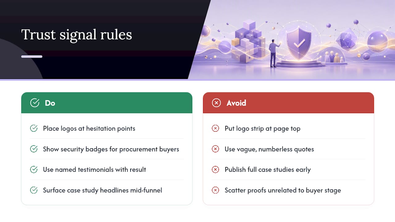
Trust signals only work when they sit at the exact moment a buyer starts to hesitate, not wherever they happen to fit in the layout. A logo strip at the very top of the homepage, before the visitor even understands what the product does, gets ignored. The same logos placed just below the hero, right after the pitch, or beside the pricing table, get noticed because they arrive exactly when the buyer starts asking, “does this actually work for a company like mine?”
Enterprise buyers look for different proof than self-serve evaluators. A security badge (SOC 2, ISO 27001, or a link to a security page) matters far more to a buyer who has to clear procurement than it does to a solo user testing a free trial. Testimonials work best when they’re specific: a named person, a named company, and a stated result outperform a vague quote about “great support.” A one-line testimonial that reads “cut our reporting time in half” does more than a paragraph of praise with no number attached.
Case study snippets belong closer to the middle of the funnel, on feature and integration pages, where a buyer is actively comparing your product against an alternative. Save the full case study page for buyers who want the deep detail, but surface the headline result earlier, on the pages where the comparison is actually happening.
Does Mobile Design Matter for a B2B Software Website?
Mobile matters more than most B2B teams assume, even though the final purchase decision rarely happens on a phone. Buyers research on mobile during commutes, forward links to colleagues from their phones, and skim pricing pages between meetings. If that experience is broken, the buyer’s first impression of your product is a broken layout, not a broken login screen.
Adaptive design for SaaS is not the same discipline as adaptive design for consumer apps. A pricing comparison table with six columns needs to collapse into something scannable on a small screen, not just shrink until the text is unreadable. Forms that ask for company size, role, and use case need to work with a thumb, not a mouse. Navigation menus with a dozen product links need a mobile pattern that doesn’t bury the one page the visitor actually came for.
Test your site on an actual phone, not just a browser’s responsive preview mode. Preview modes miss real problems: a tap target too small to hit accurately, a modal that traps the scroll, a video that autoplays and eats someone’s data plan on a train. None of that shows up in a desktop simulation, and all of it drives a mobile visitor away before they ever reach your CTA.
How Do You Personalize a SaaS Website for Different Buyer Segments?
Personalization on a B2B SaaS site works best when it’s built around role and company size, not guesswork about individual preferences. A marketing lead visiting your site cares about different proof than an IT director evaluating the same product. Serving both the same generic homepage copy means neither one sees the specific reason your product fits their job.
The simplest version of this is a segmented landing page strategy: one page for marketing teams, one for IT, one for finance, each with a headline, feature order, and case study chosen for that reader. A company-size selector early in the navigation, paired with pages tuned for startup versus mid-market versus enterprise buyers, accomplishes something similar without building an entirely separate site for each segment.
More advanced personalization uses firmographic or behavioral data to swap hero copy or CTA text based on the visitor’s industry, referral source, or prior page views. This works well when the underlying message is genuinely different for each segment. It backfires when it’s just the same page with a different name inserted into the headline. Real personalization changes which proof point leads, which feature gets top billing, and which objection gets addressed first, not just the greeting.
How Does Visual Hierarchy Guide a Visitor Toward Conversion?
Visual hierarchy decides what a visitor sees first, second, and last, and on a B2B SaaS site that order should mirror the decision path a buyer actually takes: understand the pitch, trust the proof, then act. A page where the CTA button is the same visual weight as a footer link forces the visitor to hunt for what to do next, and most visitors won’t bother hunting.
Size, contrast, and whitespace do more work here than color alone. A CTA button in a bold, high-contrast color surrounded by generous whitespace draws the eye even on a page with dozens of other elements competing for attention. Cramped layouts with too many equally weighted sections leave a visitor unsure where to look, which usually means they look nowhere and leave.
Scroll-triggered emphasis, where a secondary CTA reappears as the visitor scrolls past the point where they’ve likely made a decision, respects the natural rhythm of how people read a long page instead of forcing every choice into the first screen. The goal is a page where the next action is always obvious, whether the visitor is three seconds in or three scrolls deep.
Should a SaaS Website Include a Chatbot or Live Chat?
Chat works on a B2B SaaS site when it answers a specific, narrow question at the exact moment a buyer is stuck, not when it interrupts every visitor with a generic greeting the second the page loads. A chatbot that pops up asking “How can I help you today?” before a visitor has even read the headline adds friction instead of removing it.
The stronger pattern is a contextual trigger: a chat prompt that appears on the pricing page specifically to answer “which tier fits a team of 50?” or on the security page to route a question straight to a solutions engineer. That kind of chat shortens the sales cycle because it catches a real objection in real time, rather than making the buyer wait for a follow-up email.
For self-serve buyers, an in-app or on-page bot that can answer product questions from documentation works well because it keeps the evaluation moving without human intervention. For enterprise buyers, live chat routed to an actual sales rep, available during business hours and clearly labeled as such, builds more trust than an automated bot pretending to be a person. Mismatching the two, an automated bot on the enterprise contact page or a live-chat promise that’s actually unstaffed after 5 p.m., damages trust faster than having no chat at all.
Why Does Accessibility Matter for a B2B Software Website?
Accessibility is a design requirement, not an optional add-on, and it widens the buyer pool a SaaS site can actually convert. Enterprise procurement teams increasingly require a VPAT or accessibility statement before a deal closes, which makes accessibility a sales blocker as much as a usability issue. A site that fails basic contrast ratios or keyboard navigation can quietly disqualify a company from an enterprise deal before a salesperson ever gets on a call.
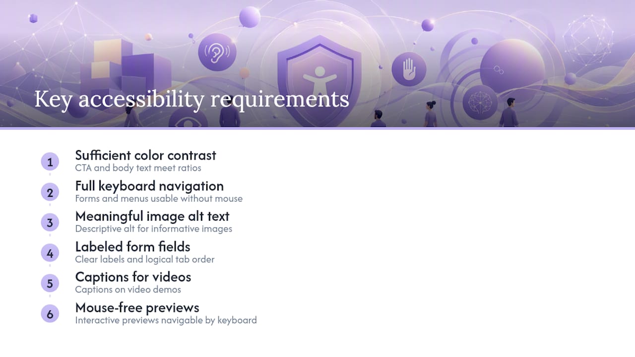
Practical steps matter more than a compliance checklist alone. Sufficient color contrast on CTA buttons and body text, full keyboard navigation through forms and menus, alt text on meaningful images, and properly labeled form fields for screen readers cover most of the ground. Video demos need captions, and any interactive product preview needs a way to navigate it without a mouse.
Designing for accessibility from the start costs far less than retrofitting it after launch, and it tends to improve usability for every visitor, not just those using assistive technology. A form with clear labels and logical tab order is easier for everyone to complete quickly, whether they’re using a screen reader or just filling it out on a slow connection during a commute.
Why Fewer Handoffs Change What a SaaS Website Can Become
Most SaaS redesigns lose their edge somewhere between the strategy deck and the shipped page. A researcher hands specs to a designer, the designer hands mockups to an engineer, and each handoff quietly reinterprets the original intent. Uxui’s integrated approach keeps product thinking and design execution in the same hands throughout a project, which means the hero message tested in research is the same one that ships, not a diluted version of it.
Fewer handoffs also mean faster approvals. When the person who designed a pricing page understands why a tier is anchored the way it is, they can defend that decision in a stakeholder review instead of guessing at the reasoning behind someone else’s file.
— Uxui
Ready to Turn These Patterns Into Your Own Site?
Most SaaS teams know their hero message is muddy or their pricing page is confusing, but they just don’t have the bandwidth to fix it properly while also shipping product. Some studios close that gap by keeping product thinking and design execution under one roof, so the audit findings, the redesign concept, and the shipped page all come from the same team instead of getting reinterpreted at every handoff.
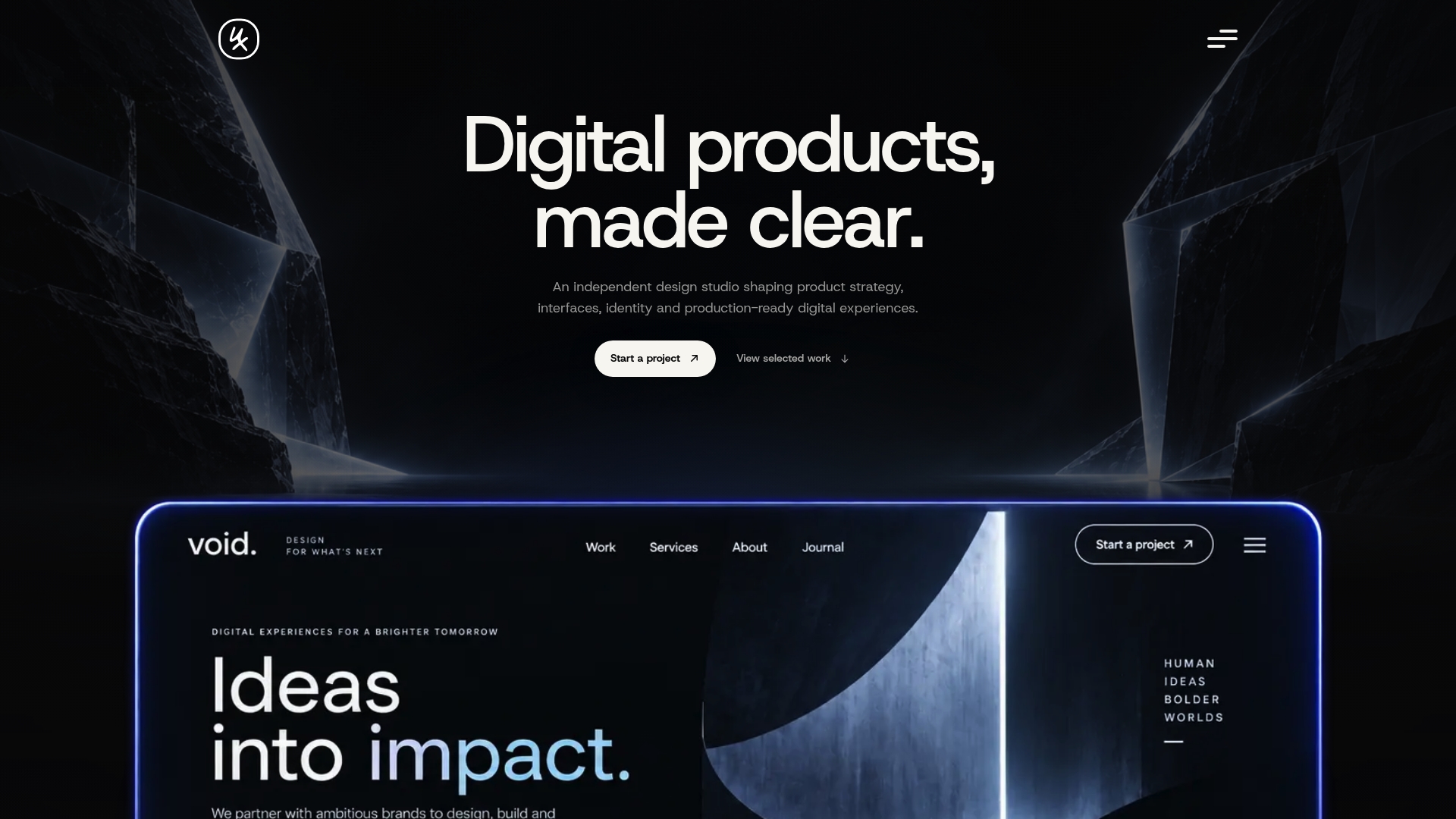
If you want a second opinion on where your site is losing buyers, start with a Professional Website Audit for 99 €, a focused review that flags the highest-impact fixes without committing to a full rebuild. If the audit turns up bigger structural issues, the Audit + Redesign Concept for 249 € gives you a concrete direction before any development work begins, and Implementation starts from 499 €. Teams that would rather launch on a proven structure than start from a blank page can look at ready-to-launch templates built for specific industries, with customization available on top. Book an audit and get a prioritized list of what to fix first.
Sources
- SaaS Website Best Practices for 2026: From Static Pages to Continuous Optimization | Spike AI
- SaaS website best practices — Lovable
- SaaS Website Design Guide 2026 — What Works, What Doesn’t, and Why | Moydus
- 35 SaaS website design examples to learn from in 2026 — Webflow Blog
FAQ
What Makes B2B SaaS Website Design Different From B2C?
B2B SaaS sites need to serve longer, multi-person buying decisions and often two distinct buyer motions, self-serve and sales-led, on the same domain. B2C sites usually optimize for a single, faster purchase path with one dominant conversion action.
How Long Do Visitors Spend Deciding on a SaaS Homepage?
Most visitors form a judgment within 10 to 20 seconds, which is why hero clarity carries more weight than almost any other design decision on the page.
How Many Pricing Tiers Should a SaaS Site Show?
Cap the visible tiers at three and use progressive disclosure for a detailed feature comparison further down the page. Anchor one tier visually as the recommended choice to speed up the decision.
What’s the Fastest Way to Improve an Existing SaaS Website?
Start with an audit that flags hero clarity, CTA friction, and pricing visibility before touching a full redesign. Uxui’s Professional Website Audit is built for exactly this first step, priced at 99 €.
Should a SaaS Site Show Different Content for Different Buyer Types?
Yes. Segmenting by role or company size, and routing self-serve and enterprise buyers to different CTAs, prevents the funnel mismatch that occurs when both buyer types are forced through one generic path.